Festival de Cannes 2022
Cinematographer Thomas Favel, AFC, discusses his choices for "Return to Seoul" by Davy Chou
On a whim, Freddie, aged 25, returns to South Korea, where she was born. The young woman avidly seeks out her origins in a foreign land, which causes her life to shift in new and unexpected directions.
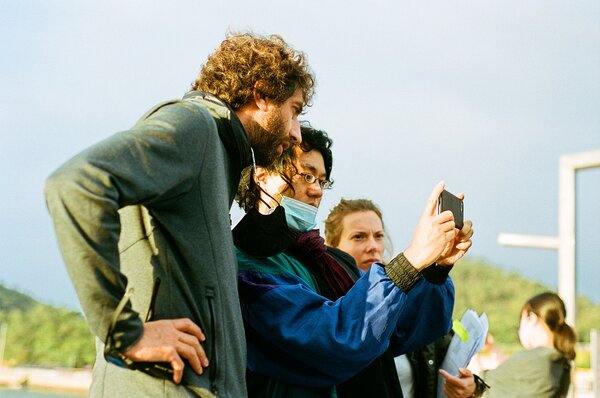
The visuals are adapted to the character
Thomas Favel : Freddie, the young heroine, has a strong internal split, her behavior is sometimes eccentric and explosive, while at other times she remains reserved and observes what is going on around her. The idea was to go from a contemplative, Asian style of cinema to a cinema inspired by the Safdie Brothers (Good Time), to follow these explosive attitudes with a jittery long-focal-length lens. For those scenes, we would shoot from the shoulder with two cameras, and to allow the actors as much place as possible, we had to hang everything up so that we could shoot at 360°. Synonyms, by Ladav Lapid, was also a film we used as a reference for the directing and the character’s energy. Finally, Davy’s camera wasn’t so nervous as all that. There is a lot of shoulder camera but it remains very stable and is often carried on an Easyrig or even a Stab One.
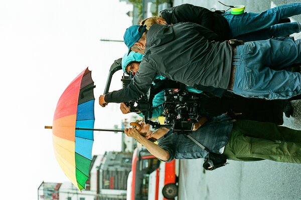
The conditions were optimal to create a shooting script
TF : The director and I arrived in Korea in mid-August 2021 and had to quarantine for 14 days. We took advantage of that time to do in-depth work on the shooting script. For the meal scenes, for example, we explored Fincher’s films shot-by-shot, especially Social Network. We even mapped out the positions on the floor. Thanks to our shooting script, we were able to save a lot of time and gain in precision when we did location scouting.

A reality that profoundly affects the character
TF : We mainly remained faithful to the way that Koreans light their interiors. In the father’s house, for example, there was an LED panel on the ceiling that created a square of bright light. Bertrand Prévot, my gaffer, and I, used this to reinforce the idea that Freddie wasn’t at home in that house. We modified the existing lighting to reinforce or accompany the character’s emotion. During the meal, at the point where she feels the worst, she is overlit by the LED lighting pouring down on her, which detaches her completely from the other members of the family.

A tripartite film highlighting each stage of the character’s development : Part 1
TF : The work on the color in the first part is important, especially in the guesthouse, which we overloaded with colors. Freddie arrives in a country she doesn’t know, and the color transmits too much information to her, and she isn’t able to sort it out.


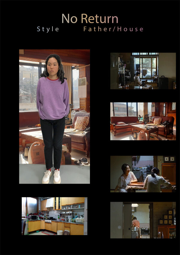
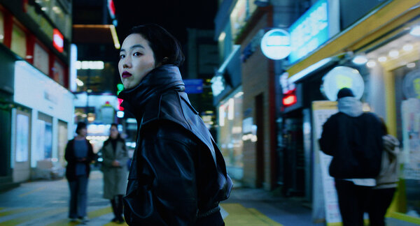
She is in a struggle with the color which, in a way, could lock her into a role she doesn’t want to fulfill. When she is in the bus before her first meeting with the father’s family, the pink color is in opposition to her violence and rejection. The pink that we brought into the scene of the country restaurant – especially during color grading, when we worked on the pink tints that come out in the bright lights – might have an aesthetically-displeasing quality, but it shows the gap between Freddie, who needs to be treated like an adult, and this strange family that infantilizes her.
The relationship to color is not present in the second and third parts of the film, or is just there as a clue or as a reminder, to show that she is trying to play with it.
A tripartite film visually highlighting each stage of the character’s development : Part 2
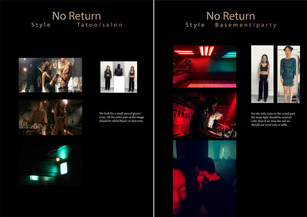
TF : In the 2d part, the tattoo parlor is an archetype of the cyberpunk universe, which is also linked to Korea, with its high-tech side and its completely retro side in a culture that is very traditional.
The underground party echoes the mounting tension at the end of the first part. Starting with the lighting, we reinforced the contrasts with glow, which allowed us to keep brightness and therefore visibility in the zone around the high lights. Then, we buried this ambience like smoke, a place which is caught between being suffocating and liberating of tension, in the color. Yannig Willmann’s work on color grading introduced several effects, accentuated the strobe lighting, and at the same time, tried to play with the limits of visibility. We maintained both this suffocation and the explosion of emotions that she is trying to contain. This choice is also there to highlight the passage from the extremely colored street (a bit like Times Square) and the street where she passes between shadow and light to arrive at the tattoo parlor (subtle little reference to The Matrix). The tattoo parlor is a place that is both warm and hostile, where red, green and yellow are in dialogue. The descent into the basement is a transition from that place to something at once even darker and warmer. This second part is the dark period in Freddie’s life.
A tripartite film highlighting each stage of the character’s development : Part 3
TF : The image and Freddie have an identity that is much more affirmed and relaxed. This is a calmer part with more classic lighting. The character is now in accord with her environment. Her emotions are no longer oppositional, as they were in the first part. Now, she is in a phase of reconciliation.
A particular intervention on the image, and the dosing of the blurs
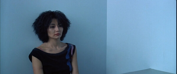
TF : We did a lot of work on definition. There are six blur values in the film to achieve the correct sharpness or detail on the faces. The image is blurrier at the beginning than at the end. The sharpest moment is the key moment of the film.
I had never played that much with the sharpness of the image inside of a film to try to maintain the readability of the faces without being bothered by over-sharpness or over-detailed images. The great many extreme closeups on the actress’ face, the fact that she is wearing little-to-no makeup, pushed us to play with the blurs in order to better compose those close-up shots.
We used Mitchell filters to model the varying levels of blur. I would put a strong Mitchell filter, usually a Mitchell D, so that Davy would be able to see what it would look like if we reduced the definition, which allowed us not to be scared to get too close to the faces. In order not to degrade the signal, we wouldn’t shoot with those filters, but we would shoot a reference image for postproduction.

A momentum towards filmic maturity
TF : For Return to Seoul, we tried out imperfections, unlike on our prior film, Diamond Island, where we wanted to remain in the plastic smoothness of a video game universe. Going towards impurity and randomness as much as possible in the directing and the cinematography was what attracted us from the beginning. We wanted the weakness that gives the character her fragility to be perceptible, by ensuring her freedom came alive and to show that she is existing in a sort of imperfection, something that is not quite a success, and not completely a failure either. We wanted to work on these imperfections visually so that we could convey the imperfection in her life. Perhaps our shared experiences on our prior films pushed us to accept filmic imperfection. Like Freddie, who accepts her life at the end of the film.
(Interview by Brigitte Barbier, and translated from French by Alexander B. Raiffe for the AFC)
 En
En Fr
Fr


