 En
En Fr
Fr
Festival de Cannes 2024
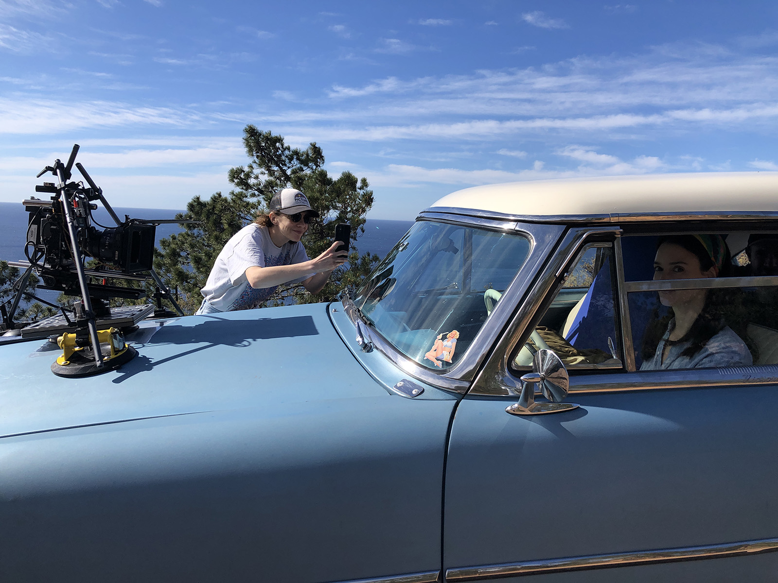
Victor Seguin, AFC, discusses the technical and artistic choices made for "Niki", by Céline Sallette

Jean-François Hensgens : Congratulations on your work on Niki. It reminded me of the film Les Intranquilles, which I shot with Joachim Lafosse in 2020. It also follows the journey of a painter struggling with mental illness, but the approach is very different. The film was partly inspired by Joachim’s childhood, but also by the life of Gérard Garouste, who willingly collaborated with Joachim Lafosse to prepare the film. Was there any collaboration with Niki de Saint Phalle’s family for Niki ?
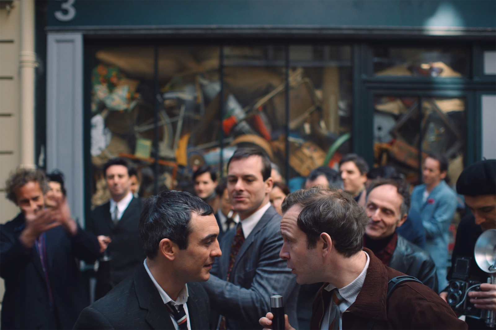
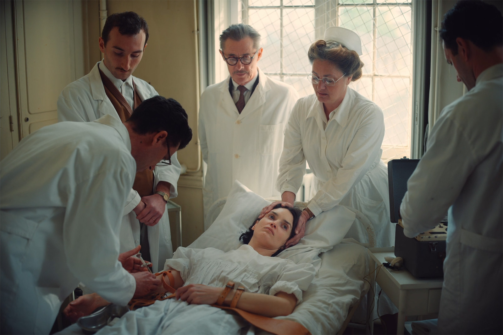
Victor Seguin : No, Niki de Saint Phalle’s heirs tend to avoid her representation or that of her work. From the start of the project, it was likely that we wouldn’t be able to show her work or even reproduce iconic images of the artist at work. But that wasn’t a major issue as it didn’t compromise the film’s creation. Niki covers the ten years preceding her well-known works and focuses on the emergence of her artistic approach while revisiting traumatic childhood memories.
Additionally, when Céline Salette began this project, she wanted to impose strong rules and constraints to guide the film’s direction. The inability to show the works ultimately became a bold and rather interesting constraint, among others.
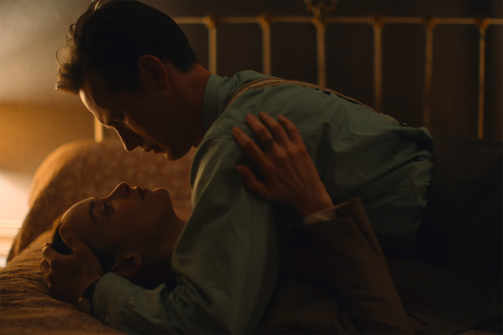
When I met her, she said to me : "I want to shoot with a small crew, without lights, without machinery, without make-up, without a script supervisor...". She obviously had experience on set as an actress, and the whole filming setup seemed too cumbersome and restrictive to her. Her shoot with Philippe Garrel in a small crew had given her a desire for something more spontaneous and creative.
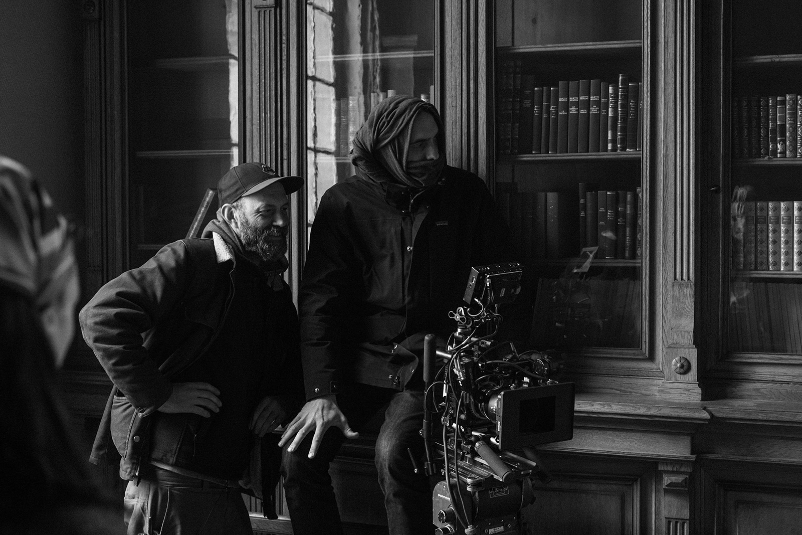
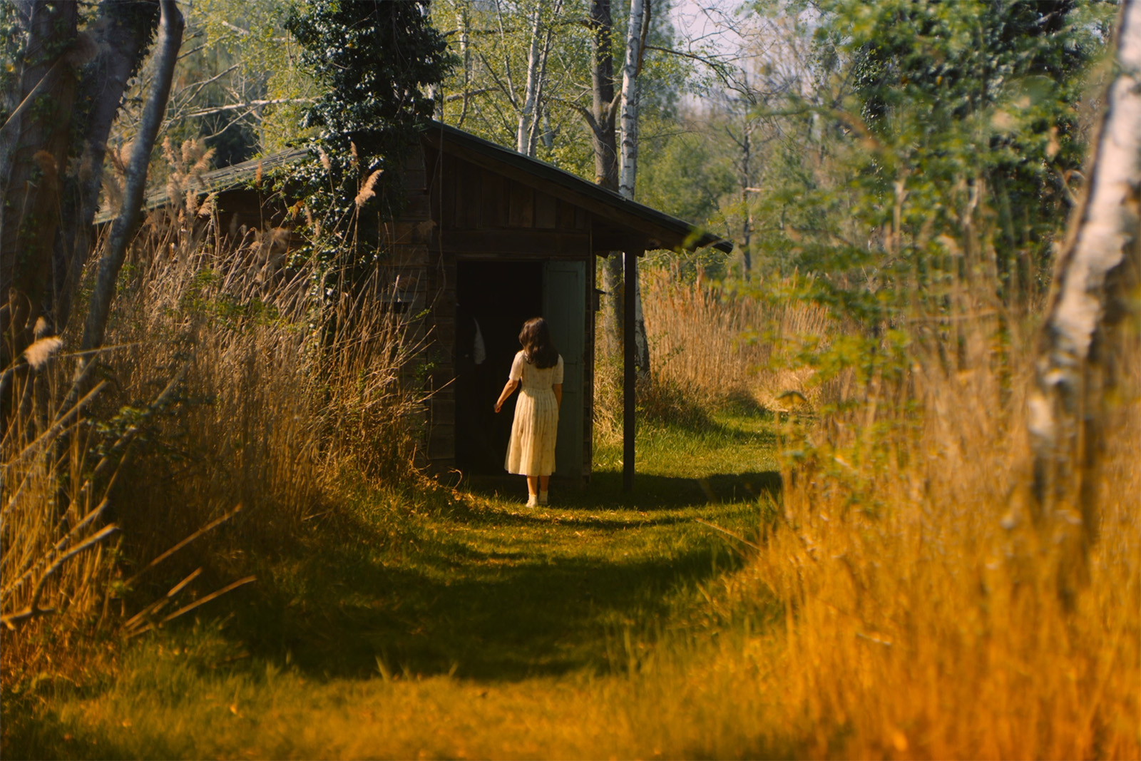
Even so, we had to shoot a period film, with many sets and actors, within the timeframe of a fairly classic production schedule. We had to find the right balance with Céline and the production manager to keep things as simple as possible without the lack of manpower slowing us down. The actors did their own make-up, just like in a theatre company. I kept two electricians, but we mainly worked with natural or practical light diffusion and reflection. The camera was on a tripod, and we managed without a grip. The frame was therefore fixed, and we panned if necessary. This last constraint made perfect sense in terms of the film’s pictorial theme.
JFH : Was there this idea that the film’s shots substitute the works themselves ?
VS : It’s difficult to evoke Niki de Saint Phalle’s "Nanas" or "Tirs" simply through the frame, and her early pictorial works are relatively unknown. This constraint of not showing the works led us to the idea that the camera would take the point of view of her work, looking back at Niki. As if her future work were looking at her, calling out to her. This is also the movement created by the flashback scenes, both the re-emergence of the buried past and the emergence of her future work.
JFH : In Les Intranquilles, the camera is very mobile, handheld. The camera work focuses on the character’s feverishness, very jittery at times and almost lethargic at others. The shallow depth of field isolates Leïla Bekhti’s character in her paranoia. I was projecting what she was feeling.
VS : The shallow depth of field brings out the pictorial theme and that of madness in a different way. The hand-held camera is really like a dance between the actors and the camera together.
JFH : Yes, that’s really Lafosse’s style of filmmaking. That’s what he wants to explore, and so do I.
VS : Céline’s approach was the opposite. The idea was to give the actors space and to take a step back. It’s an opposite approach, but in both cases, the actor is at the centre.
JFH : Do you think it comes from her experience as an actress ?
VS : Yes, and perhaps a certain wariness of the heaviness that technique can represent. But our system was still quite flexible. Because the team was small, because Charlotte Le Bon is also a director, and that Jean-Pierre Duret (the sound engineer) kept a close eye on Céline’s work, whom she fully trusted in return, everyone was very diligent and caring. Discussions about editing, lighting, set design and make-up, for example, flowed easily in this small team.
JFH : The artistic direction seems very elaborate. What was your reflection beforehand ?
VS : I like to try and find a rule to follow regarding the use of colours.
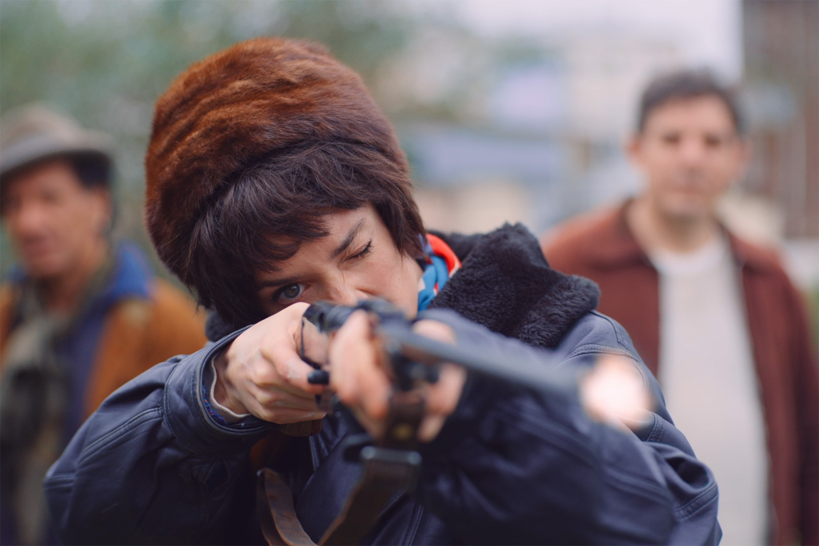
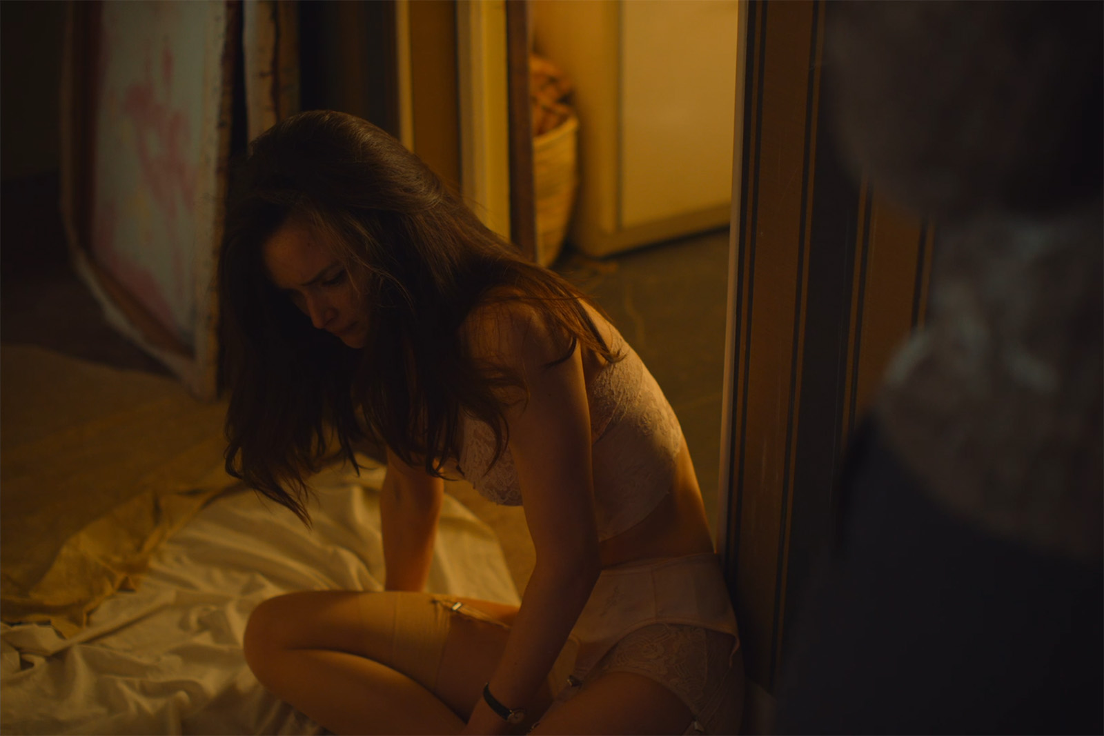
Often it quickly falls apart, but something always comes out of it. Here, we had Niki de Saint Phalle’s colour palette for her work, those of her "Tirs" and her "Nanas". Highly saturated colours : red, green, sky blue, midnight blue, pink, yellow and orange. There were images from the fifties that Céline had grouped in a mood board to illustrate her script, somewhat faded colours, pastel or black and white. Then there were these flashbacks or nightmares that punctuate the film, bringing back to the character’s memory the incest she suffered, plunging her into a state of madness that she fights against through her creations. We decided that these nightmares would each bring out the colours in the film. It was as if the process of recovering her memory would reveal her future work and its colours. Once all the colours were brought together, Niki would find her way and the strength to face her childhood trauma.
Céline also wanted a particular visual treatment for these flashbacks. I tried different things, different gradings, filters, distorting mirrors, prisms... During these tests, I also used one of those small lighting filters to add touches of colour, reflections and distortions to the image. This rudimentary idea ultimately proved to be the most interesting visually. Effective and a bit artisanal.
JFH : This real-time work reminds me of what Berto told me about The Diving Bell and the Butterfly, where he played the character’s eyelids closing by putting his fingers in front of the lens. A bit like Méliès cinema, very DIY, very artisanal.
VS : Yes, I think that suited Céline well, her idea of a small team, of doing things together on set.
JFH : And how did you choose this 1.5:1 aspect ratio ?
VS : There was no obvious choice. It was both a group film where we could use the screen’s width and a confinement film where a squarer format could help to ’suffocate’ the character in the frame. Céline had prepared a large mood board where she associated each scene with photos documenting the period and the character. I thought these photos were an important starting point. Photography is really the medium of memory, in society or family. Since the film has a lot to do with memories, the common 24x36 photo format could prove to be interesting. It’s a rather naïve, simple idea. We could have justified it differently, but basically that was the thought process.
JFH : For me, the slightly square format evokes a feeling of confinement. The whole film is about that ; the family, the hospital, and the frame constrain the character.
VS : It’s true that it helps. But you shot Les Intranquilles in CinemaScope, and we get this feeling of confinement through other means : the shallow depth of field and the camera that never leaves the characters. I always feel like I am making an arbitrary decision when choosing the aspect ratio. It doesn’t tell a story by itself, but it can help tell one.
JFH : I saw in the credits that you colour-graded the film. I’m a bit older than you and I have the impression that your generation gets more hands-on with these tools. How do you use this ability ?
VS : I learned to use Resolve by making short films where you couldn’t expect much help from the labs. On feature films, there’s rarely the possibility of having a DIT, and producers no longer understand the value of having dailies graded. I’ve therefore gotten into the habit of retrieving each day’s dailies to grade them myself daily. I’m not the only one doing this. It really fills a need that productions no longer want to handle. This routine allows me to have a daily look at my work, to deliver dailies to editing with a more precise and advanced visual intention. Director, editor, producer, distributor... everyone is happy to see edited versions with a proper image. It’s very difficult to revert what was done during shooting at the final grading stage. Directors learn to love their film with these images, and it’s harsh to change everything at the end.
JFH : I directed a film, and after three days of colour-grading, Richard Deusy, with whom I usually work, said to me : "You have to forget about it or we’ll be stuck !" and yet I’d done the photography and I know the process well. It’s the same for the music used during editing.
VS : Grading has become so important, for me it’s also a way of taking control of my tools and to have a very direct relationship with my work on the image. During filming, there’s an intuition that’s often right. A logic to the film that’s hard to find with the same accuracy six months later. The post-production on Niki was a bit chaotic towards the end, I couldn’t find a colourist I wanted to work with to finish the film, the dates were scattered. I decided to try and do it myself. Céline trusted me, and it extended the idea of the small team shoot and a more direct relationship to the creation. It was the first time I’d ever done it. But after trying out a lot of things, the result was pretty close to what I’d done at the time of the pre-grading. It was an interesting experience, but I’m not sure that it added much to the film. I was happy to find a good colourist for the next film.
JFH : Colourists are important partners. I like the idea of someone coming in to reinterpret the film. I’ve made a number of films and I’ve only been able to get a DIT two or three times. It’s super important to gauge the visual level of your LUT during the shoot. It’s always better to do a bit more, because it’s easier to dial back than to add more in grading. But if you start with a LUT that’s a bit too green and the rushes aren’t colour-graded, the director will see this throughout the entire edit. When we get to colour-grading, everything is reset and the director sees everything in pink. Nowadays, we hardly have the opportunity to develop these LUTs during pre-production. Productions don’t want to spend the money. With today’s tools, it’s interesting to be able to become autonomous like you.
VS : It’s true that we often prepare LUTs with rather abstract images shot at a rental house, or, at best, on an important set of the film and we spend half a day with a colourist. If we haven’t found what we want by the end of that half-day, we’re stuck for the entire shoot.
JFH : When I made the film with Daniel Auteuil, which will be shown at Cannes, I applied a very strong visual style for him to get used to and I textured a lot in-camera with the Alexa 35. But the DNx36 compression of the rushes for the edit smoothed out all the texture. Since then, I’ve been fighting to have the rushes sent for editing in DNx115.
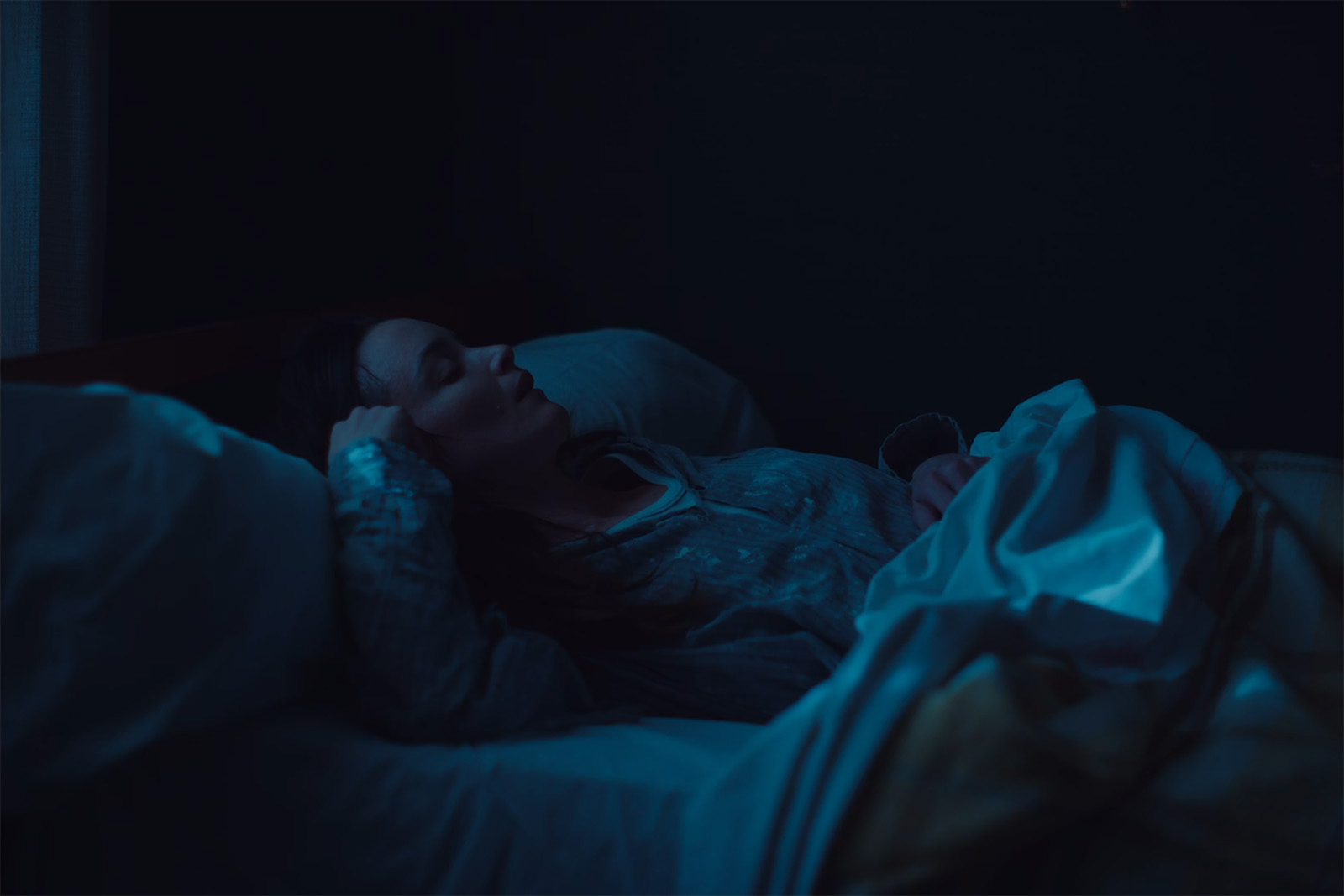
VS : I had the same problem on Niki. I’d prepared a beautiful ‘vintage’ texture with a bit of grain and halation effects. Céline had seen this on small screens for months or compressed for projection. She really discovered during colour-grading that the film had quite a fine texture and resolution. Ultimately, the added texture on the rushes bothered her. She felt that the slight blur generated by the grain and diffusion distanced her from her actors. We kept a slightly rawer image from the shoot, even if it meant having a slightly video effect at times. I used the Sony Venice at 2500 ISO and vintage lenses, so the film isn’t smooth either.
JFH : What lenses did you use ?
VS : We shot with Panavision’s PVintage series. I like the way Panavision lenses naturally highlight actors. With little to no lighting, we needed tools that naturally helped. The series is designed for a Super 35 sensor and we shot in Full Frame with the Venice to make use of the strange blurring at the edges of the lenses.
(Inteview conducted by Jean-François Hensgens, AFC, SBC, and translated from French by Chloé Finch for the AFC)


